You need to enable JavaScript in order to use the AI chatbot tool powered by ChatBot

Why Understanding Feature Usage is Important?

Share via:
blog-cms-banner-bg
Little-Known Negotiation Hacks to Get the Best Deal on Slack
cta-bg-blogDownload Your Copy

HIPAA Compliance Checklist for 2025

Download PDF

Think about the last time you rolled out a new SaaS tool and assumed everyone was using it as intended. Logins looked fine. Adoption dashboards looked fine. Yet something still felt… off. The real insight wasn’t in who accessed the tool; it was in what they actually did inside it.

Feature usage tells a story most teams never see. It exposes underutilized upgrades, unused add-ons, and expensive tiers that don’t match real needs.

In this article, we’ll cover why feature-level visibility matters, what breaks when you can’t see it, and how the right platform turns app usage data into smarter SaaS decisions.

TL;DR 

  • Most teams track usage through scattered dashboards, spreadsheets, and delayed reports, which hides how tools and features are actually being used.
  • Missing feature-level visibility leads to silent waste, weak renewal leverage, unnecessary access, budget friction, and stalled adoption.
  • CloudEagle builds a connected, real-time view of feature usage by pulling signals from 500+ integrations, admin logs, SSO events, finance systems, and app-level data.
  • The platform links feature activity with permissions, automates reviews and workflows, and helps teams act on usage patterns without manual work.
  • With clearer visibility into what’s used and what’s ignored, teams manage spend confidently, reduce risk, and support better adoption across the SaaS stack.

Master SaaS Management

Get a practical guide to streamline your SaaS stack, improve visibility, and reduce silent waste across your tools.

Download Guide
CTA Thumbnail

1. How Teams Track Usage Today?

Most teams still piece things together with a mix of tools, exports, and guesswork. You bounce between admin dashboards, CSV downloads, and half-updated spreadsheets trying to make sense of who’s using what. It feels like walking through fog – you see movement, but not the details that matter.

Admins check one dashboard for logins. Another for actions. Another for license counts. And then someone emails a spreadsheet that says something completely different. Welcome to the daily loop.

Some teams lean on APIs, browser plugins, or discovery engines to pull in access data. Others depend on app owners or department leads to “share what they see,” which usually means you’re working with opinions more than evidence. And tools like Zscaler or Netskope help you spot access, but they don’t tell you if anyone used the features you’re actually paying for.

A few groups run periodic reviews monthly or only during renewals. By then, the data feels old. And the decisions get rushed.

Here’s the pattern we see across most companies:

  • Isolated dashboards with different definitions of “usage.”
  • Spreadsheets stitched together by ops teams trying to fill the gaps.
  • Vendor consoles that show broad activity but miss feature-level depth.
  • Security logs that confirm access but don’t show what happened after login
  • Shadow IT that never shows up anywhere unless someone reports it.

As a result, you get a partial picture. Enough to guess, not enough to act with confidence. Feature usage, the real insight behind upgrades, renewals, and right-sizing, stays hidden.

2. What Problems Do Teams Face When They Can’t See Feature Usage Clearly?

You start losing control. Not in a dramatic movie-scene way, but in the quiet way where small gaps stack up until the numbers stop making sense. Costs rise. Access expands. And decisions drift further from reality because no one can see what’s happening inside the tools you already pay for.

Teams often buy premium tiers, automation suites, AI add-ons, or analytics modules, expecting big returns. But most users stick to the basics. The unused parts stay buried, and the spending keeps rolling forward. Year after year.

Renewals turn into a guessing game. You walk into a vendor meeting without proof of what’s used and what’s dormant. No evidence to downgrade. No data to push back. Vendors know this, and they price conversations accordingly.

Security gaps widen, too. Extra features usually come with extra permissions. Without usage data, it’s tough to spot who carries access they never touch. Privileged roles stay overassigned. Least-access policies turn into a wish rather than a practice.

Budget planning takes a hit. Finance teams rely on usage patterns to predict seat needs, tier changes, and upcoming renewals. Missing data means inflated budgets for tools that deliver less value than expected.

Momentum slips on the productivity side as well. If employees skip high-value features, no one knows. Teams miss chances to guide training, improve workflows, or help people get more from the tools they already have.

And tool sprawl grows quietly. Two apps may offer the same advanced features. Without visibility, consolidation never gets off the ground. You pay for the same outcomes twice.

Here’s the real cost of missing feature-level visibility:

  • Hidden waste across premium modules and add-ons
  • Weak leverage during renewal cycles
  • Unnecessary access that widens your risk surface
  • Budget uncertainty is built on incomplete data
  • Slow enablement because no one sees where adoption stalls
  • Redundant tools that stay in the stack far longer than needed

Feature usage isn’t a nice-to-have metric. It’s the context that ties spend, access, and adoption together. Without it, every part of your SaaS strategy starts running on guesswork.

Fix License Waste Fast

Learn how to identify unused licenses, reclaim overspend, and right-size your stack with confidence.

Download Now
CTA Thumbnail

3. How Does CloudEagle Help You Understand Feature Usage at a Deeper Level?

Traditional usage tracking leaves gaps everywhere. Each app has its own dashboard. Admin reports rarely align. And by the time spreadsheets are stitched together, the data is outdated. CloudEagle takes a different approach. It builds a connected, feature-level map of your entire SaaS stack, fed by live signals from every relevant source.

Below is exactly how the platform works behind the scenes.

a. Deep integrations that surface real feature signals

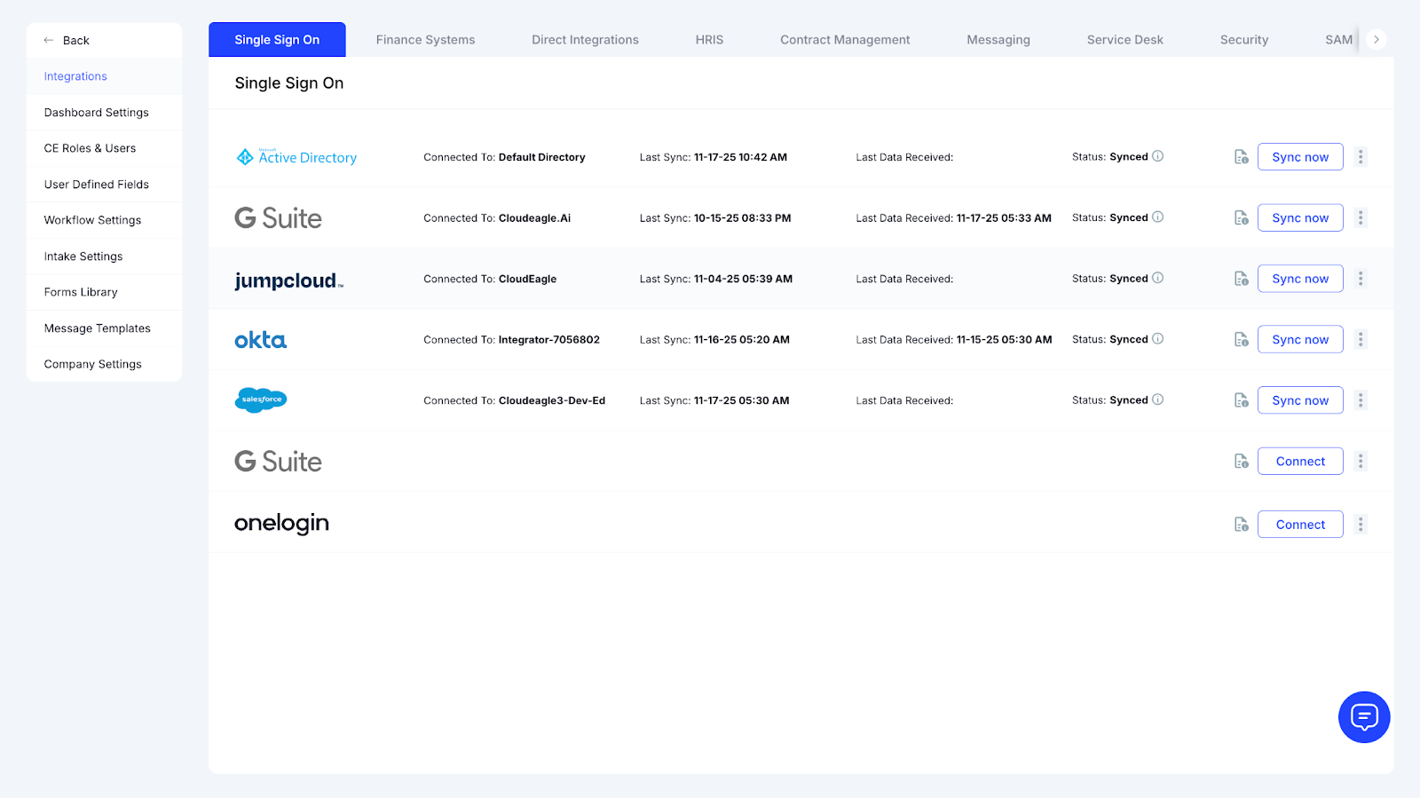
Before you can make sense of usage, you need raw data from every corner of your environment. CloudEagle pulls this in through 500+ integrations across your identity provider, SaaS consoles, finance tools, expense data, admin logs, and app APIs.

It pulls activity from:

  • Sign-in events
  • Feature-level telemetry
  • Permission graphs
  • Browser-level signals for unfederated apps
  • License assignment logs
  • Finance transactions

Single Sign-On integrations page showing Active Directory, G Suite, JumpCloud, Okta, and Salesforce sync status

This blend creates a full picture instead of a partial one.

CloudEagle doesn’t rely on a single source. It cross-correlates signals so feature insights don’t get distorted by missing data.

b. One window to see how features are actually used

Once the data is collected, CloudEagle organizes it into a unified usage view. No more clicking through apps or exporting CSVs.

Here’s what the view brings together:

What You See What it means
Feature-level adoption Which parts of a tool do your teams actually touch
Module usage Whether premium modules deliver value
Team-level patterns Who uses what across roles or departments
Trends over time How usage rises, settles, or drops

This consolidates everything into a single place, so usage stops being a guessing game.

c. Usage insight connected to access and permissions

Most tools stop at adoption metrics. CloudEagle adds access intelligence to the same view.

This exposes gaps you wouldn’t catch otherwise.

You can see:

  • Users with advanced access who don’t use the features tied to it
  • Roles with high permissions but minimal activity
  • Modules are assigned broadly when only a small group interacts with them

Salesforce license utilization dashboard displaying licenses bought, provisioned users, usage breakdown, and potential savings.

This makes it easy to compare assigned access with actual behavior without switching systems.

d. Structured reviews built for feature-level oversight

Usage reviews can be run on any app or module. CloudEagle automatically compiles:

  • Every user with access
  • Their activity level
  • The features they interacted with
  • Their department, role, and login status
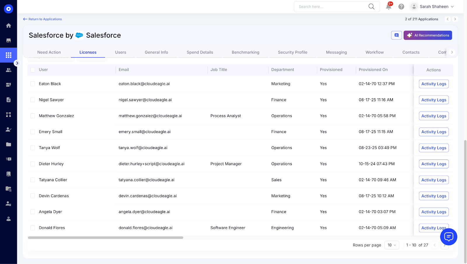
Salesforce user list showing employee names, email addresses, departments, and provisioning status.

This simplifies the entire review flow. No digging through vendor dashboards or asking app owners to summarize adoption.

Here’s how a typical review starts:

  • Pick the application
  • CloudEagle fetches the usage graph
  • The system groups usage by role, team, and module
  • You validate access based on the usage depth shown

It removes the manual lift from monthly or quarterly reviews.

e. Automation workflows that respond to usage behavior

Once you identify gaps, you can turn them into automated actions. You can build workflows that react when usage falls, rises, or changes shape.

These workflows can trigger when:

  • Feature usage drops below a defined threshold
  • A user stops using high-tier capabilities
  • Adoption signals drop after a role or department change
  • Admin-level features go untouched

Actions can include license changes, notifications, access adjustments, or requests for manager review.

f. Benchmarks that show whether your usage makes sense

CloudEagle compares your feature usage patterns against organizations of similar size and stack profiles. This context helps you interpret adoption patterns instead of looking at numbers in isolation.

Benchmarks can include:

  • Module-level adoption averages
  • Depth of feature usage compared to peer groups
  • Frequency of use for advanced capabilities
  • Usage shape for premium tiers vs. basic tiers

It helps you understand whether your usage is typical or if you’re overpaying for capabilities others rarely use.

Optimize SaaS Operations Smarter

Unlock practical steps to streamline SaaS workflows, improve visibility, and reduce operational chaos.

Download Guide
CTA Thumbnail

4. Why is CloudEagle the Best Platform for Feature-Level Visibility? 

a. A deeper integration footprint than typical SaaS managers

Many tools stop after connecting the top 30 or 50 apps because that’s where most users spend time. CloudEagle goes far beyond that. It plugs into more than 500 SaaS applications, including niche tools, industry-specific platforms, and custom enterprise workflows.

This wide coverage gives you the kind of visibility you’d miss with lighter integrations. If a feature is used anywhere across your stack, even in long-tail or department-owned tools, CloudEagle brings it into view.

b. Insight that goes past logins and activity counts

Most platforms capture the basics: active users, inactive users, and login frequency. CloudEagle captures the layers beneath those numbers.

You see:

  • Which features drive engagement
  • Which modules sit unused
  • How advanced capabilities are adopted
  • Where interaction patterns differ across teams

This helps teams understand the real depth of usage instead of relying on surface-level metrics.

c. Usage and access intelligence in the same frame

Other platforms usually specialize in either usage analytics or access governance. CloudEagle blends both.

This combined view lets you spot patterns such as:

  • Advanced access is assigned to users who never touch the features tied to it
  • Premium roles that don’t match real activity
  • High-risk capabilities are used by a smaller audience than expected

This context helps identify where entitlement and behavior drift apart.

d. Workflows that act on insights instead of storing them

Some tools only produce dashboards. CloudEagle lets you convert insights into automated actions.

These actions can include:

  • Adjusting licenses
  • Triggering reminders or manager reviews

Automated low-usage email alert notifying a user about not logging into Salesforce for 30 days.

  • Starting renewal workflows
  • Reassigning seats when usage drops

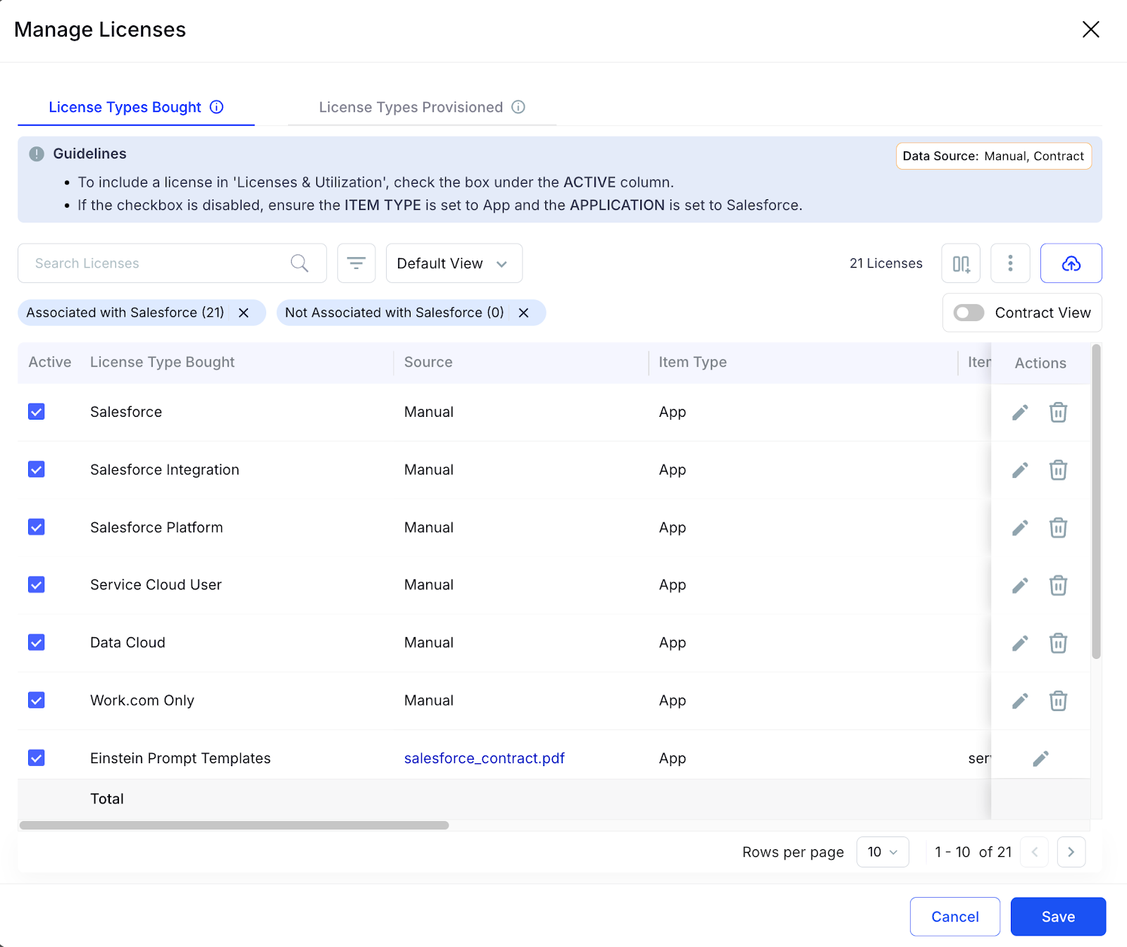
Manage Salesforce licenses modal displaying license types bought, item types, and edit or delete actions.

It removes the manual burden that usually follows a usage audit.

e. Renewal intelligence grounded in real usage data

CloudEagle prepares teams for renewals with usage-driven insights instead of broad estimates.

You get:

  • Seat recommendations tied to feature engagement
  • Adoption summaries broken down by module
  • Benchmarks against similar organizations
  • Forecasts shaped by usage trends

It equips procurement and finance with the evidence they usually scramble to collect.

f. Benchmarks that show how your usage compares to real customers

Generic industry benchmarks don’t help much. CloudEagle uses data from companies with similar profiles, giving you a more honest comparison.

You can see whether your adoption is:

  • Higher than peers
  • Below are typical usage patterns
  • Concentrated in a few teams
  • Spread unevenly across roles

This makes optimization decisions more grounded.

g. Built to support teams across the enterprise

CloudEagle supports the workflows of teams that each look at usage differently.

It supports:

  • Budget reviews led by the CIO or the finance teams
  • License rationalization led by procurement
  • Permission audits run by security
  • Adoption improvement driven by IT
  • Department-level reviews run by tool owners

Everyone works from the same source of truth instead of disconnected dashboards or exported files.

Feature Visibility That Brings Your SaaS Stack Back Into Focus

Understanding feature usage isn’t about tracking clicks. It’s about seeing the truth behind your spending, your adoption patterns, and the gaps that quietly expand when no one’s watching.

Once that visibility slips, everything else follows - renewals, budgets, permissions, productivity. It becomes harder to tell what’s working and what’s just sitting in the stack collecting dust.

CloudEagle brings that clarity back. It shows what people actually use, how deep their engagement goes, and where access no longer matches behavior. That awareness gives teams the confidence to make decisions without guesswork holding them back.

When usage becomes visible, everything becomes easier: planning, optimizing, reducing risk, and helping teams get more from the tools they already have. 

That’s the real value of understanding feature usage at a deeper level.

Advertisement for a SaaS Subscription Tracking Template with a call-to-action button to download and a partial graphic of a tablet showing charts.Banner promoting a SaaS Agreement Checklist to streamline SaaS management and avoid budget waste with a call-to-action button labeled Download checklist.Blue banner with text 'The Ultimate Employee Offboarding Checklist!' and a black button labeled 'Download checklist' alongside partial views of checklist documents from cloudeagle.ai.Digital ad for download checklist titled 'The Ultimate Checklist for IT Leaders to Optimize SaaS Operations' by cloudeagle.ai, showing checklist pages.Slack Buyer's Guide offer with text 'Unlock insider insights to get the best deal on Slack!' and a button labeled 'Get Your Copy', accompanied by a preview of the guide featuring Slack's logo.Monday Pricing Guide by cloudeagle.ai offering exclusive pricing secrets to maximize investment with a call-to-action button labeled Get Your Copy and an image of the guide's cover.Blue banner for Canva Pricing Guide by cloudeagle.ai offering a guide to Canva costs, features, and alternatives with a call-to-action button saying Get Your Copy.Blue banner with white text reading 'Little-Known Negotiation Hacks to Get the Best Deal on Slack' and a white button labeled 'Get Your Copy'.Blue banner with text 'Little-Known Negotiation Hacks to Get the Best Deal on Monday.com' and a white button labeled 'Get Your Copy'.Blue banner with text 'Little-Known Negotiation Hacks to Get the Best Deal on Canva' and a white button labeled 'Get Your Copy'.Banner with text 'Slack Buyer's Guide' and a 'Download Now' button next to images of a guide titled 'Slack Buyer’s Guide: Features, Pricing & Best Practices'.Digital cover of Monday Pricing Guide with a button labeled Get Your Copy on a blue background.Canva Pricing Guide cover with a button labeled Get Your Copy on a blue gradient background.

Enter your email to
unlock the report

Oops! Something went wrong while submitting the form.
License Count
Benchmark
Per User/Per Year

Enter your email to
unlock the report

Oops! Something went wrong while submitting the form.
License Count
Benchmark
Per User/Per Year

Enter your email to
unlock the report

Oops! Something went wrong while submitting the form.
Notion Plus
License Count
Benchmark
Per User/Per Year
100-500
$67.20 - $78.72
500-1000
$59.52 - $72.00
1000+
$51.84 - $57.60
Canva Pro
License Count
Benchmark
Per User/Per Year
100-500
$74.33-$88.71
500-1000
$64.74-$80.32
1000+
$55.14-$62.34

Enter your email to
unlock the report

Oops! Something went wrong while submitting the form.

Enter your email to
unlock the report

Oops! Something went wrong while submitting the form.
Zoom Business
License Count
Benchmark
Per User/Per Year
100-500
$216.00 - $264.00
500-1000
$180.00 - $216.00
1000+
$156.00 - $180.00

Enter your email to
unlock the report

Oops! Something went wrong while submitting the form.

Get the Right Security Platform To Secure Your Cloud Infrastructure

Please enter a business email
Thank you!
The 2023 SaaS report has been sent to your email. Check your promotional or spam folder.
Oops! Something went wrong while submitting the form.

Access full report

Please enter a business email
Thank you!
The 2023 SaaS report has been sent to your email. Check your promotional or spam folder.
Oops! Something went wrong while submitting the form.

Think about the last time you rolled out a new SaaS tool and assumed everyone was using it as intended. Logins looked fine. Adoption dashboards looked fine. Yet something still felt… off. The real insight wasn’t in who accessed the tool; it was in what they actually did inside it.

Feature usage tells a story most teams never see. It exposes underutilized upgrades, unused add-ons, and expensive tiers that don’t match real needs.

In this article, we’ll cover why feature-level visibility matters, what breaks when you can’t see it, and how the right platform turns app usage data into smarter SaaS decisions.

TL;DR 

  • Most teams track usage through scattered dashboards, spreadsheets, and delayed reports, which hides how tools and features are actually being used.
  • Missing feature-level visibility leads to silent waste, weak renewal leverage, unnecessary access, budget friction, and stalled adoption.
  • CloudEagle builds a connected, real-time view of feature usage by pulling signals from 500+ integrations, admin logs, SSO events, finance systems, and app-level data.
  • The platform links feature activity with permissions, automates reviews and workflows, and helps teams act on usage patterns without manual work.
  • With clearer visibility into what’s used and what’s ignored, teams manage spend confidently, reduce risk, and support better adoption across the SaaS stack.

Master SaaS Management

Get a practical guide to streamline your SaaS stack, improve visibility, and reduce silent waste across your tools.

Download Guide
CTA Thumbnail

1. How Teams Track Usage Today?

Most teams still piece things together with a mix of tools, exports, and guesswork. You bounce between admin dashboards, CSV downloads, and half-updated spreadsheets trying to make sense of who’s using what. It feels like walking through fog – you see movement, but not the details that matter.

Admins check one dashboard for logins. Another for actions. Another for license counts. And then someone emails a spreadsheet that says something completely different. Welcome to the daily loop.

Some teams lean on APIs, browser plugins, or discovery engines to pull in access data. Others depend on app owners or department leads to “share what they see,” which usually means you’re working with opinions more than evidence. And tools like Zscaler or Netskope help you spot access, but they don’t tell you if anyone used the features you’re actually paying for.

A few groups run periodic reviews monthly or only during renewals. By then, the data feels old. And the decisions get rushed.

Here’s the pattern we see across most companies:

  • Isolated dashboards with different definitions of “usage.”
  • Spreadsheets stitched together by ops teams trying to fill the gaps.
  • Vendor consoles that show broad activity but miss feature-level depth.
  • Security logs that confirm access but don’t show what happened after login
  • Shadow IT that never shows up anywhere unless someone reports it.

As a result, you get a partial picture. Enough to guess, not enough to act with confidence. Feature usage, the real insight behind upgrades, renewals, and right-sizing, stays hidden.

2. What Problems Do Teams Face When They Can’t See Feature Usage Clearly?

You start losing control. Not in a dramatic movie-scene way, but in the quiet way where small gaps stack up until the numbers stop making sense. Costs rise. Access expands. And decisions drift further from reality because no one can see what’s happening inside the tools you already pay for.

Teams often buy premium tiers, automation suites, AI add-ons, or analytics modules, expecting big returns. But most users stick to the basics. The unused parts stay buried, and the spending keeps rolling forward. Year after year.

Renewals turn into a guessing game. You walk into a vendor meeting without proof of what’s used and what’s dormant. No evidence to downgrade. No data to push back. Vendors know this, and they price conversations accordingly.

Security gaps widen, too. Extra features usually come with extra permissions. Without usage data, it’s tough to spot who carries access they never touch. Privileged roles stay overassigned. Least-access policies turn into a wish rather than a practice.

Budget planning takes a hit. Finance teams rely on usage patterns to predict seat needs, tier changes, and upcoming renewals. Missing data means inflated budgets for tools that deliver less value than expected.

Momentum slips on the productivity side as well. If employees skip high-value features, no one knows. Teams miss chances to guide training, improve workflows, or help people get more from the tools they already have.

And tool sprawl grows quietly. Two apps may offer the same advanced features. Without visibility, consolidation never gets off the ground. You pay for the same outcomes twice.

Here’s the real cost of missing feature-level visibility:

  • Hidden waste across premium modules and add-ons
  • Weak leverage during renewal cycles
  • Unnecessary access that widens your risk surface
  • Budget uncertainty is built on incomplete data
  • Slow enablement because no one sees where adoption stalls
  • Redundant tools that stay in the stack far longer than needed

Feature usage isn’t a nice-to-have metric. It’s the context that ties spend, access, and adoption together. Without it, every part of your SaaS strategy starts running on guesswork.

Fix License Waste Fast

Learn how to identify unused licenses, reclaim overspend, and right-size your stack with confidence.

Download Now
CTA Thumbnail

3. How Does CloudEagle Help You Understand Feature Usage at a Deeper Level?

Traditional usage tracking leaves gaps everywhere. Each app has its own dashboard. Admin reports rarely align. And by the time spreadsheets are stitched together, the data is outdated. CloudEagle takes a different approach. It builds a connected, feature-level map of your entire SaaS stack, fed by live signals from every relevant source.

Below is exactly how the platform works behind the scenes.

a. Deep integrations that surface real feature signals

Before you can make sense of usage, you need raw data from every corner of your environment. CloudEagle pulls this in through 500+ integrations across your identity provider, SaaS consoles, finance tools, expense data, admin logs, and app APIs.

It pulls activity from:

  • Sign-in events
  • Feature-level telemetry
  • Permission graphs
  • Browser-level signals for unfederated apps
  • License assignment logs
  • Finance transactions

Single Sign-On integrations page showing Active Directory, G Suite, JumpCloud, Okta, and Salesforce sync status

This blend creates a full picture instead of a partial one.

CloudEagle doesn’t rely on a single source. It cross-correlates signals so feature insights don’t get distorted by missing data.

b. One window to see how features are actually used

Once the data is collected, CloudEagle organizes it into a unified usage view. No more clicking through apps or exporting CSVs.

Here’s what the view brings together:

What You See What it means
Feature-level adoption Which parts of a tool do your teams actually touch
Module usage Whether premium modules deliver value
Team-level patterns Who uses what across roles or departments
Trends over time How usage rises, settles, or drops

This consolidates everything into a single place, so usage stops being a guessing game.

c. Usage insight connected to access and permissions

Most tools stop at adoption metrics. CloudEagle adds access intelligence to the same view.

This exposes gaps you wouldn’t catch otherwise.

You can see:

  • Users with advanced access who don’t use the features tied to it
  • Roles with high permissions but minimal activity
  • Modules are assigned broadly when only a small group interacts with them

Salesforce license utilization dashboard displaying licenses bought, provisioned users, usage breakdown, and potential savings.

This makes it easy to compare assigned access with actual behavior without switching systems.

d. Structured reviews built for feature-level oversight

Usage reviews can be run on any app or module. CloudEagle automatically compiles:

  • Every user with access
  • Their activity level
  • The features they interacted with
  • Their department, role, and login status

Salesforce user list showing employee names, email addresses, departments, and provisioning status.

This simplifies the entire review flow. No digging through vendor dashboards or asking app owners to summarize adoption.

Here’s how a typical review starts:

  • Pick the application
  • CloudEagle fetches the usage graph
  • The system groups usage by role, team, and module
  • You validate access based on the usage depth shown

It removes the manual lift from monthly or quarterly reviews.

e. Automation workflows that respond to usage behavior

Once you identify gaps, you can turn them into automated actions. You can build workflows that react when usage falls, rises, or changes shape.

These workflows can trigger when:

  • Feature usage drops below a defined threshold
  • A user stops using high-tier capabilities
  • Adoption signals drop after a role or department change
  • Admin-level features go untouched

Actions can include license changes, notifications, access adjustments, or requests for manager review.

f. Benchmarks that show whether your usage makes sense

CloudEagle compares your feature usage patterns against organizations of similar size and stack profiles. This context helps you interpret adoption patterns instead of looking at numbers in isolation.

Benchmarks can include:

  • Module-level adoption averages
  • Depth of feature usage compared to peer groups
  • Frequency of use for advanced capabilities
  • Usage shape for premium tiers vs. basic tiers

It helps you understand whether your usage is typical or if you’re overpaying for capabilities others rarely use.

Optimize SaaS Operations Smarter

Unlock practical steps to streamline SaaS workflows, improve visibility, and reduce operational chaos.

Download Guide
CTA Thumbnail

4. Why is CloudEagle the Best Platform for Feature-Level Visibility? 

a. A deeper integration footprint than typical SaaS managers

Many tools stop after connecting the top 30 or 50 apps because that’s where most users spend time. CloudEagle goes far beyond that. It plugs into more than 500 SaaS applications, including niche tools, industry-specific platforms, and custom enterprise workflows.

This wide coverage gives you the kind of visibility you’d miss with lighter integrations. If a feature is used anywhere across your stack, even in long-tail or department-owned tools, CloudEagle brings it into view.

b. Insight that goes past logins and activity counts

Most platforms capture the basics: active users, inactive users, and login frequency. CloudEagle captures the layers beneath those numbers.

You see:

  • Which features drive engagement
  • Which modules sit unused
  • How advanced capabilities are adopted
  • Where interaction patterns differ across teams

This helps teams understand the real depth of usage instead of relying on surface-level metrics.

c. Usage and access intelligence in the same frame

Other platforms usually specialize in either usage analytics or access governance. CloudEagle blends both.

This combined view lets you spot patterns such as:

  • Advanced access is assigned to users who never touch the features tied to it
  • Premium roles that don’t match real activity
  • High-risk capabilities are used by a smaller audience than expected

This context helps identify where entitlement and behavior drift apart.

d. Workflows that act on insights instead of storing them

Some tools only produce dashboards. CloudEagle lets you convert insights into automated actions.

These actions can include:

  • Adjusting licenses
  • Triggering reminders or manager reviews

Automated low-usage email alert notifying a user about not logging into Salesforce for 30 days.

  • Starting renewal workflows
  • Reassigning seats when usage drops

Manage Salesforce licenses modal displaying license types bought, item types, and edit or delete actions.

It removes the manual burden that usually follows a usage audit.

e. Renewal intelligence grounded in real usage data

CloudEagle prepares teams for renewals with usage-driven insights instead of broad estimates.

You get:

  • Seat recommendations tied to feature engagement
  • Adoption summaries broken down by module
  • Benchmarks against similar organizations
  • Forecasts shaped by usage trends

It equips procurement and finance with the evidence they usually scramble to collect.

f. Benchmarks that show how your usage compares to real customers

Generic industry benchmarks don’t help much. CloudEagle uses data from companies with similar profiles, giving you a more honest comparison.

You can see whether your adoption is:

  • Higher than peers
  • Below are typical usage patterns
  • Concentrated in a few teams
  • Spread unevenly across roles

This makes optimization decisions more grounded.

g. Built to support teams across the enterprise

CloudEagle supports the workflows of teams that each look at usage differently.

It supports:

  • Budget reviews led by the CIO or the finance teams
  • License rationalization led by procurement
  • Permission audits run by security
  • Adoption improvement driven by IT
  • Department-level reviews run by tool owners

Everyone works from the same source of truth instead of disconnected dashboards or exported files.

Feature Visibility That Brings Your SaaS Stack Back Into Focus

Understanding feature usage isn’t about tracking clicks. It’s about seeing the truth behind your spending, your adoption patterns, and the gaps that quietly expand when no one’s watching.

Once that visibility slips, everything else follows - renewals, budgets, permissions, productivity. It becomes harder to tell what’s working and what’s just sitting in the stack collecting dust.

CloudEagle brings that clarity back. It shows what people actually use, how deep their engagement goes, and where access no longer matches behavior. That awareness gives teams the confidence to make decisions without guesswork holding them back.

When usage becomes visible, everything becomes easier: planning, optimizing, reducing risk, and helping teams get more from the tools they already have. 

That’s the real value of understanding feature usage at a deeper level.

CloudEagle.ai recognized in the 2025 Gartner® Magic Quadrant™ for SaaS Management Platforms
Download now
gartner chart
5x
Faster employee
onboarding
80%
Reduction in time for
user access reviews
30k
Workflows
automated
$15Bn
Analyzed in
contract spend
$2Bn
Saved in
SaaS spend

Recognized as an Industry leader for our AI

CloudEagle.ai is Recognized in the 2024 Gartner® Magic Quadrant™ for SaaS Management Platforms

Recognition highlights CloudEagle’s innovation and leadership in the rapidly evolving SaaS management and procurement space.
Read More
Gartner Magic Quadrant for SaaS Management Platforms showing a chart divided into Challengers and Leaders quadrants with various companies plotted as dots.

CloudEagle.ai Recognized in the GigaOm Radar for SaaS Management Platforms

CloudEagle named a Leader and Outperformer in GigaOm Radar Report, validating its impact in the SaaS management platform landscape.
Read More
gigaom

Everest Group Positions CloudEagle.ai as a Trailblazer in SaaS Management Platforms

CloudEagle recognized as a Trailblazer by Everest Group, showcasing its rapid growth and innovation in SaaS spend and operations management.
Read More
qks

CloudEagle.ai is Recognized in the 2024 Gartner® Magic Quadrant™ for SaaS Management Platforms

Recognition highlights CloudEagle’s innovation and leadership in the rapidly evolving SaaS management and procurement space.
Read More
gartner

Streamline SaaS governance and save 10-30%

Book a Demo with Expert
CTA image
One platform to Manage
all SaaS Products
Learn More